Modernising a Classic: How to Refresh a 2014 Design with Today's Trends

 
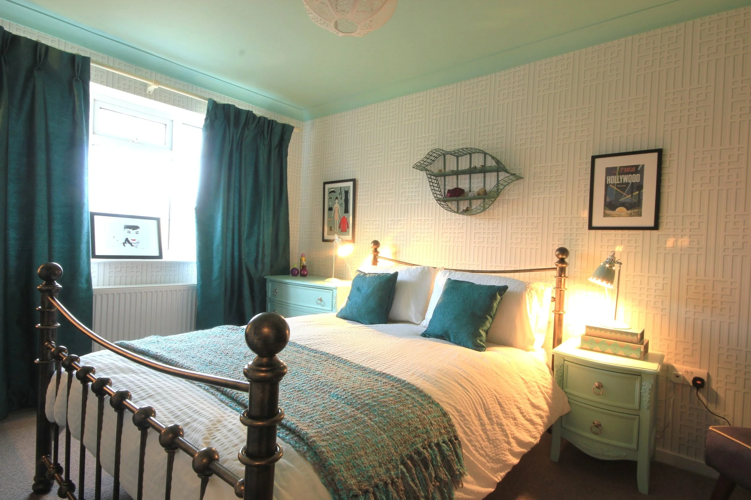
Bedroom with bronze metal bed in the centre. Light grey art deco wallpaper on all the walls. Mint green painted ceiling with bedside tables in the same colour
 

This photo is from an interior design project I worked on in 2014. It was back when I was a design assistant on BBC’s DIY SOS, and new to working in the interior design world. The interiors were designed by Laurence Llewelyn Bowen and this was one of my favourite rooms in the house.

This photo is now 10 years old and you can’t buy any of the items in the photo any more. It got me thinking about how to revamp this design to fit with today’s trends whilst also keeping the original style. So let me walk you through my process:

1.     What are the main features in the room that need to stay?

The most striking things in the design are the deco-style wallpaper, the bird shelving, the painted ceiling, and the metal frame bed. If I wanted to recreate anything close to this room, these items needed to stay as close to the same as possible.

2. How to find new items that are a good replacement to these main features?

For this, I analysed each of the main items in the room, looking at their colour, shape and style. I tried to match at least two out of these three things when finding a more modern replacement, for example the wallpaper I found has the same style and colour, however, the shape of the pattern is different.

The Wallpaper:
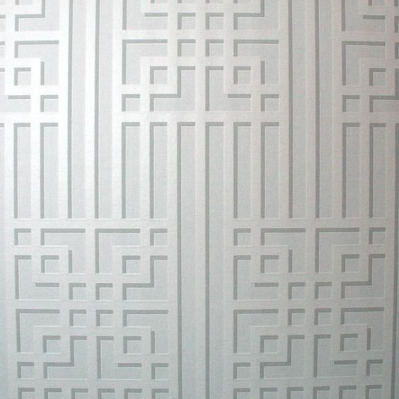
 
Geometric art deco wallpaper in grey

Original wallpaper

 
Grey art deco wallpaper

new wallpaper


The Bed:

 
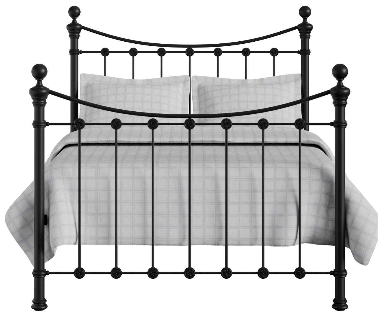
Black metal bed with high footboard
 

The metal bedframe in the original interior scheme was in bronze. I’ve found an alternative in a similar shape and style, but struggled to find a bronze finish. This makes me think that really this bronze colour is no longer on trend and I went with a black finish which is much more widely available.

The Colour:
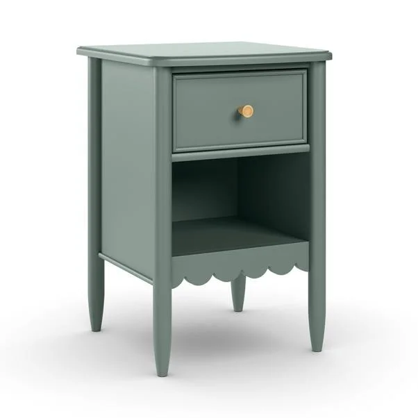
 
Sage Green bedside table with one drawer and scallop base
 

The main colour in the room was mint green and it was on the ceiling and the bedside tables. The base of the tables had a curved edge, which is quite late 90s/ 00s in style. Needless to say, I can’t find a very good match. When looking for mint green side tables I came across these beauties from Dunelm with a scallop edge at the base. This feels like style upgrade for both the shape and the colour or the tables. This sage green colour has been popular in the last few years with Benjamin Moore choosing sage green as their colour of the year in 2022.

The Bird Shelves:
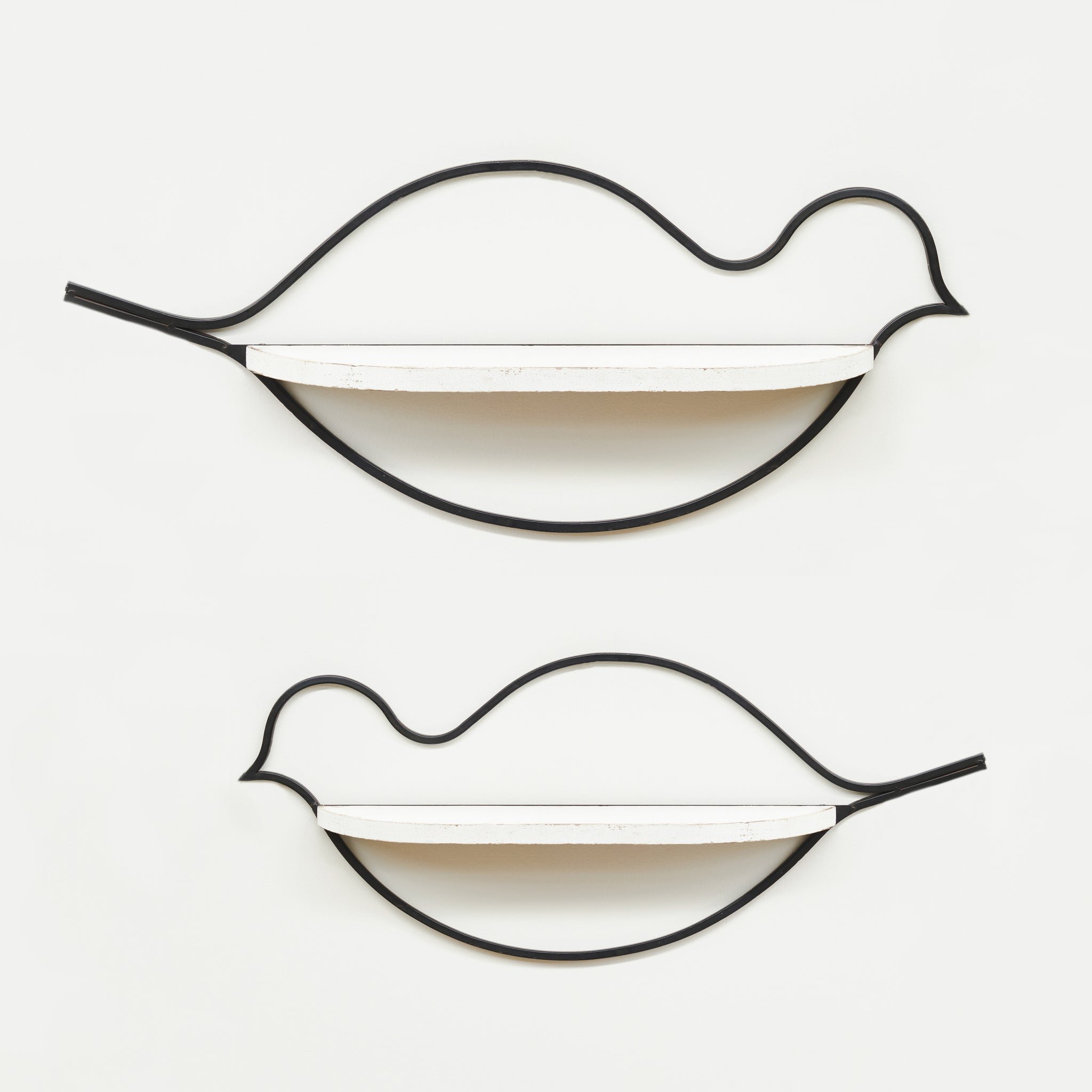
 
Black wire bird shape with white shelf in the middle
 

I’m pretty sure that the bird shelf in the photo was from Homesense. If you haven’t discovered Homesense yet, you are in for a treat. It is the home décor branch of TK Maxx, think discount prices on branded items and one of a kind items. I think the shelves were unfortunately a one of a kind item. Anyway, I also think that the original shelves in the photo are probably a bit outdated with the industrial sides etc and a revamp is a good idea. The ones I have selected have much cleaner lines and are more like a piece of line art. It’s contemporary and still has the bird shape, so ties in with the previous scheme.

The other items, like the accent colour, the artwork and the cushions don’t really affect the style of the room, so long as the main items are well selected. I chose to change up these items to make the room feel a bit fresher. 

This is the final updated design:
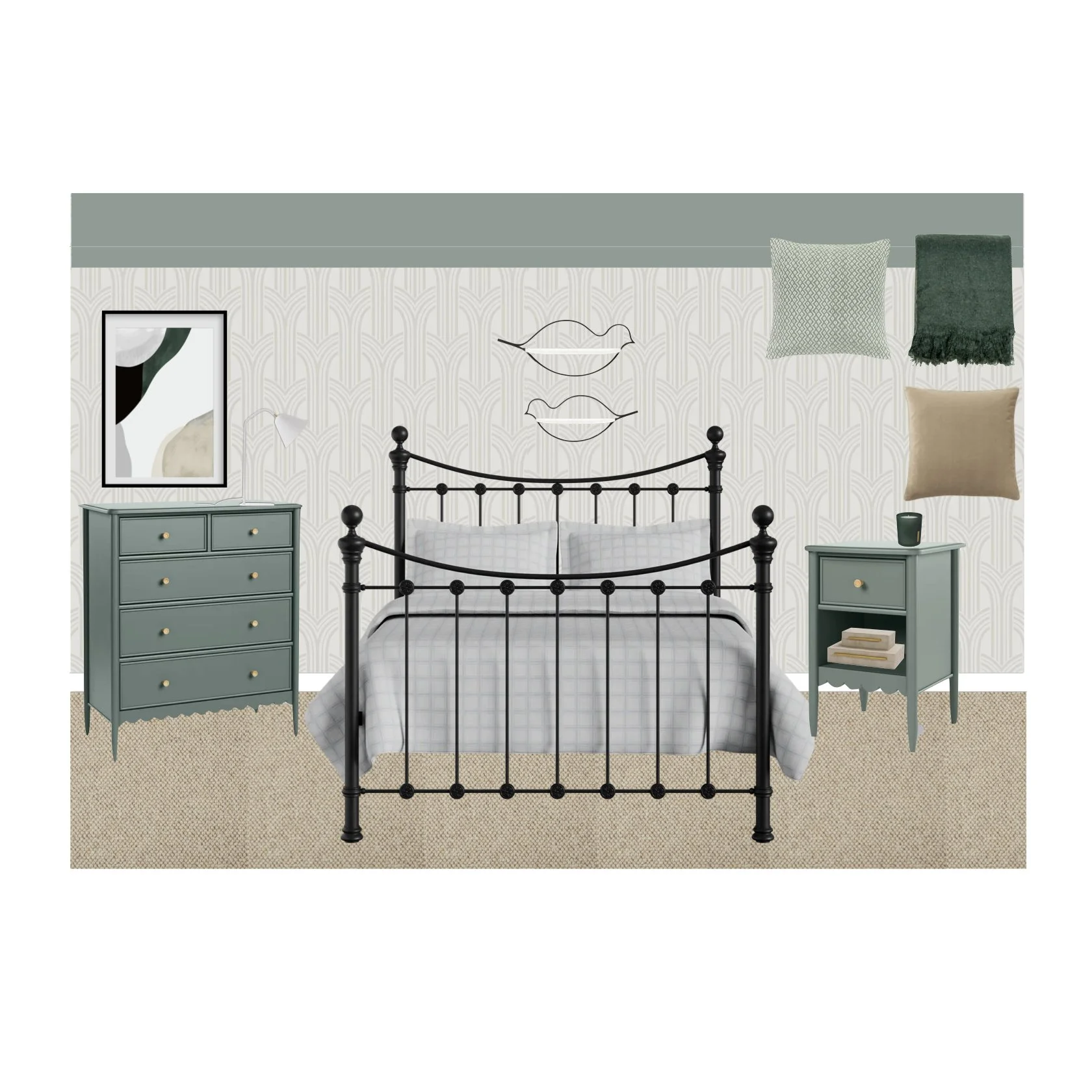
 
Interior design moodboard showing a green bedroom with light grey art deco wallpaper, a black metal bed in the centre and green bedside tables with a matching green ceiling
 

Shopping List:

Bed - Selkirk Solo in Black - Original Bed Company - Link

Carpet - Oatflake Fair Isle Wool Carpet - Knotistry - Link

Chest of Drawers - Remi 5 Drawer Chest in Lilypad - Dunelm - Link

Bedside Table - Remi 1 Drawers Bedside Table in Lilypad - Dunelm - Link

Wallpaper - Deco Arches - Wallpaper Direct - Link

Bird Shelves - Rustic Chic: Pair of Bird Outline Wall Shelves - Stone the Crows - Link

Art - Sage Green Wall Art - Etsy - Link

Neutral Cushions - Large Plain Velvet Cushion Cover in Porridge - Oka - Link

Green Cushions - Ladwell Sage Green Cushion Cover - Dunelm - Link

Throw - Malini Serena Blanket Jade - Olivia’s - Link

Lamp - Copita Metal Table Lamp - La Redoute - Link

Boxes - Faux Ivory Shagreen Leather Boxes - Etsy - Link

Candle - Ritual of Jing Scented Candle - Rituals - Link

Stephanie Williams Designs provides online interior design services creating mood boards and shopping lists for any of your interior design projects. If you have a photo from Instagram or Pinterest of an interior design style that you love but you don’t know how to recreate it in your own house contact Stephanie here.

Designing for DIY SOS in Carbis Bay

DIY SOS: The Big Build is BBC1’s BAFTA award winning home makeover programme. The programme is presented by Nick Knowles who, with his team of builders, a designer and hundreds of local volunteers, transform the homes of families across the country who have gone through difficult life-changing situations. I have worked on DIY SOS on and off for 7 years, including tonight’s episode in Carbis Bay, Cornwall.

 
Bright coastal style living room with blue and orange accents in the soft furnishings
 

Stephen and Lynn Smedley spent 15 years fostering a total of 103 children and were ready for a well deserved retirement in their two bedroom bungalow by the sea. Unfortunately, tragedy struck in April 2017 when their daughter, Carrie, died suddenly leaving behind her 3 sons. With no dad on the scene, Stephen and Lynn brought their three grandsons home to live with them. When I visited the Smedleys’ home, the three boys were sleeping in a triple bunkbed in the same room, there was only one bathroom for the 5 of them and Lynn was doing all of her washing and ironing in the garden shed. It was obvious that they needed more space for everyone to be able to grieve and grow together. 

 
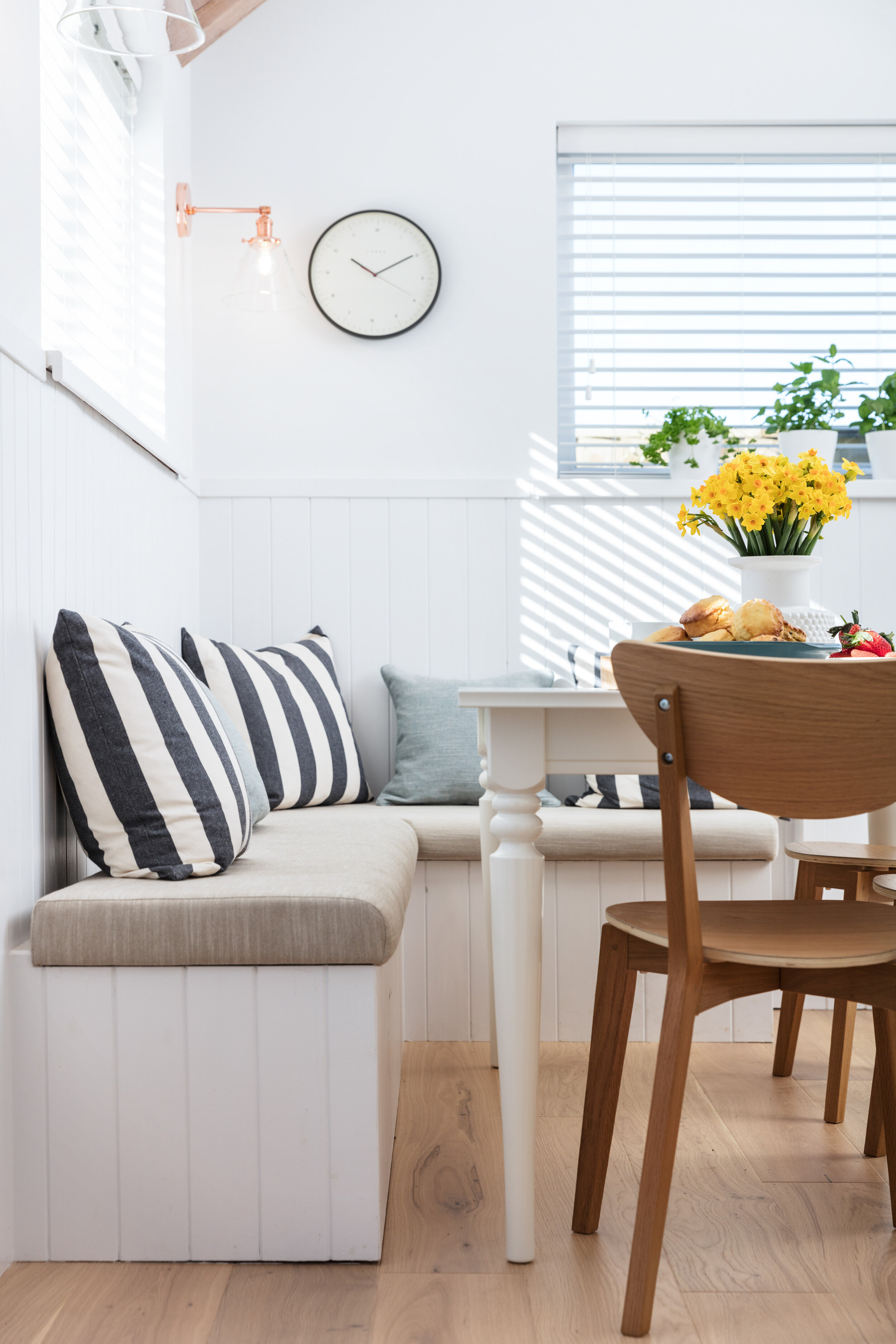
Bright white dining room with tongue and groove panelling on the upholstered banquette and walls.
 

The most crucial part of the design was the new layout of the bungalow. We had to create two new bedrooms and a new bathroom. Also, we wanted to have two communal spaces in the form of a living room and a kitchen diner. Having this was important to the family as it would allow the boys to play their video games in one room whilst Stephen and Lynn could sit elsewhere. Many hours were spent drawing and redrawing the plans for the house - it really was a tight squeeze!

 
Turquoise bedroom with a white built in bed with orange soft furnishings
 

Working with Gabrielle Blackman is always a joy and this house was no different. We felt that the house needed to feel bright and spacious so we used an off white colour as the main colour throughout the house to reflect the light into the rooms, making them feel bigger. Also, with Carbis Bay being right on the Cornish coast, we wanted to use this image and incorporate the blue and green palette that you associate with the ocean into the scheme, so the majority of the rooms have those colours in them.

 
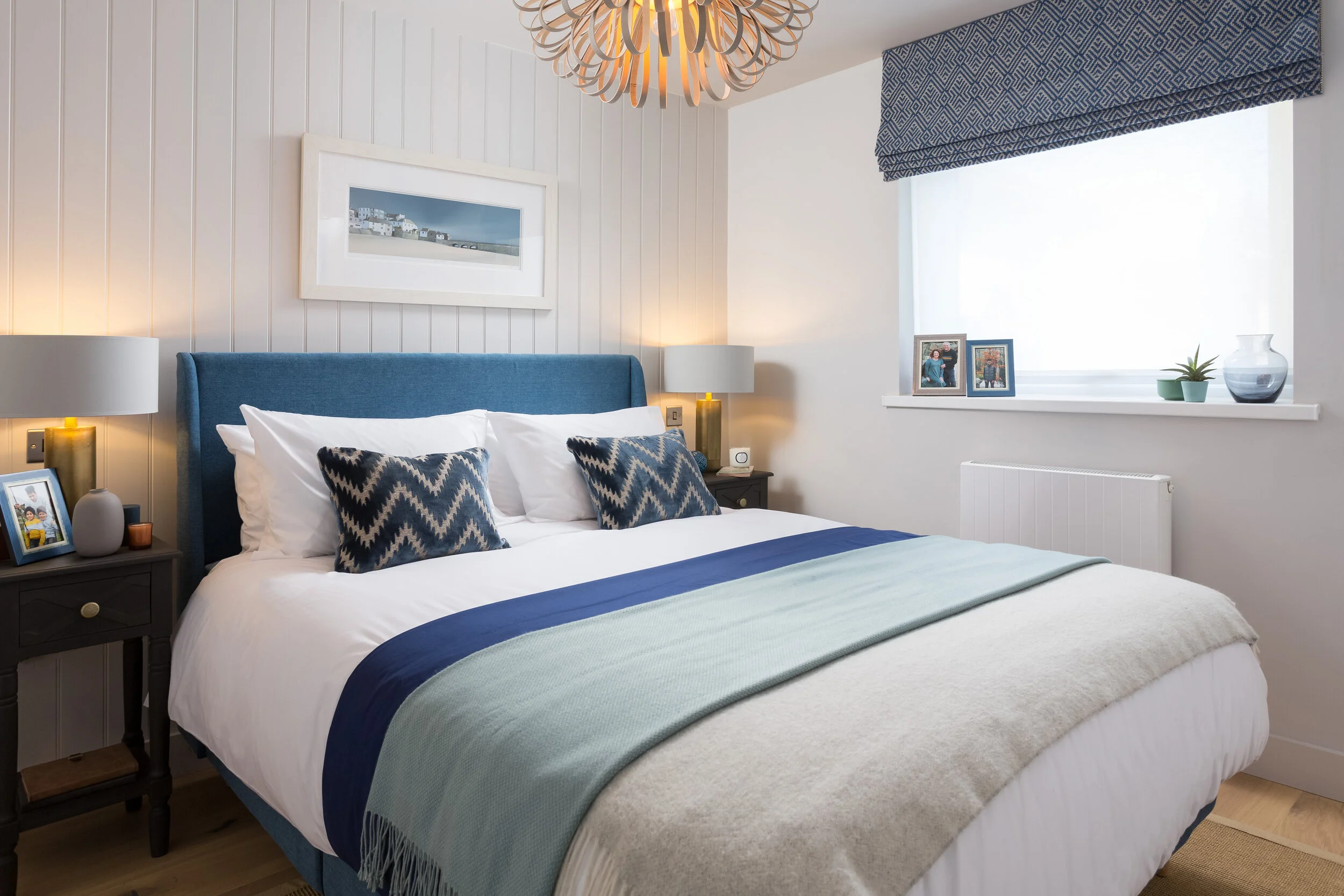
Off white master bedroom with tongue and groove feature wall and a blue upholstered bed
 

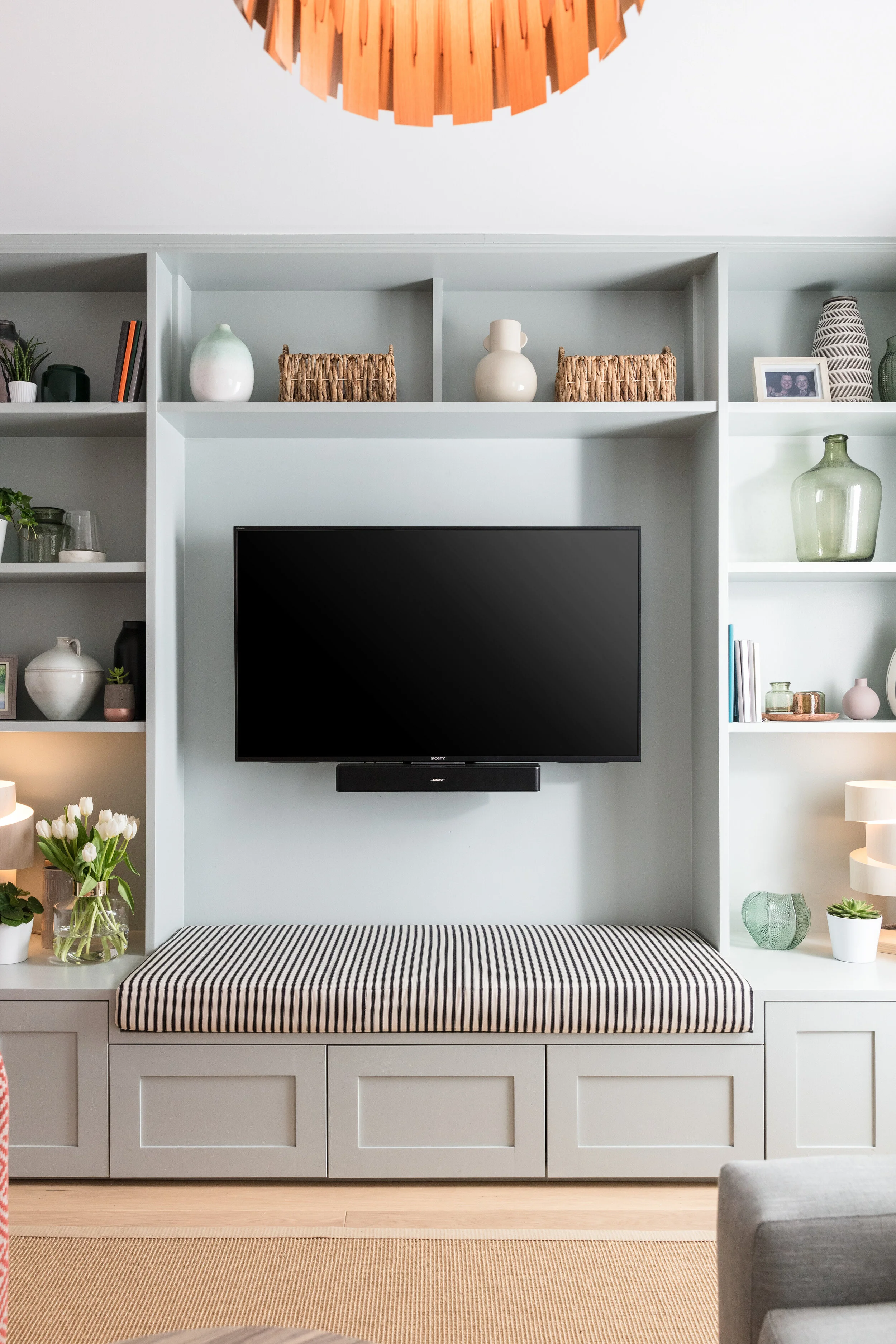
The living area needed to have enough space to fit all 5 members of the family, plus room for any friends they may have over if they were entertaining. We had New Concept Interiors make a bespoke armchair and sofa, so that we could get the seating to fit the room perfectly. We also incorporated a bench within the built-in TV unit to create that extra bit of seating. 

 
Bespoke built in TV unit with stripy upholstered bench under the TV
 

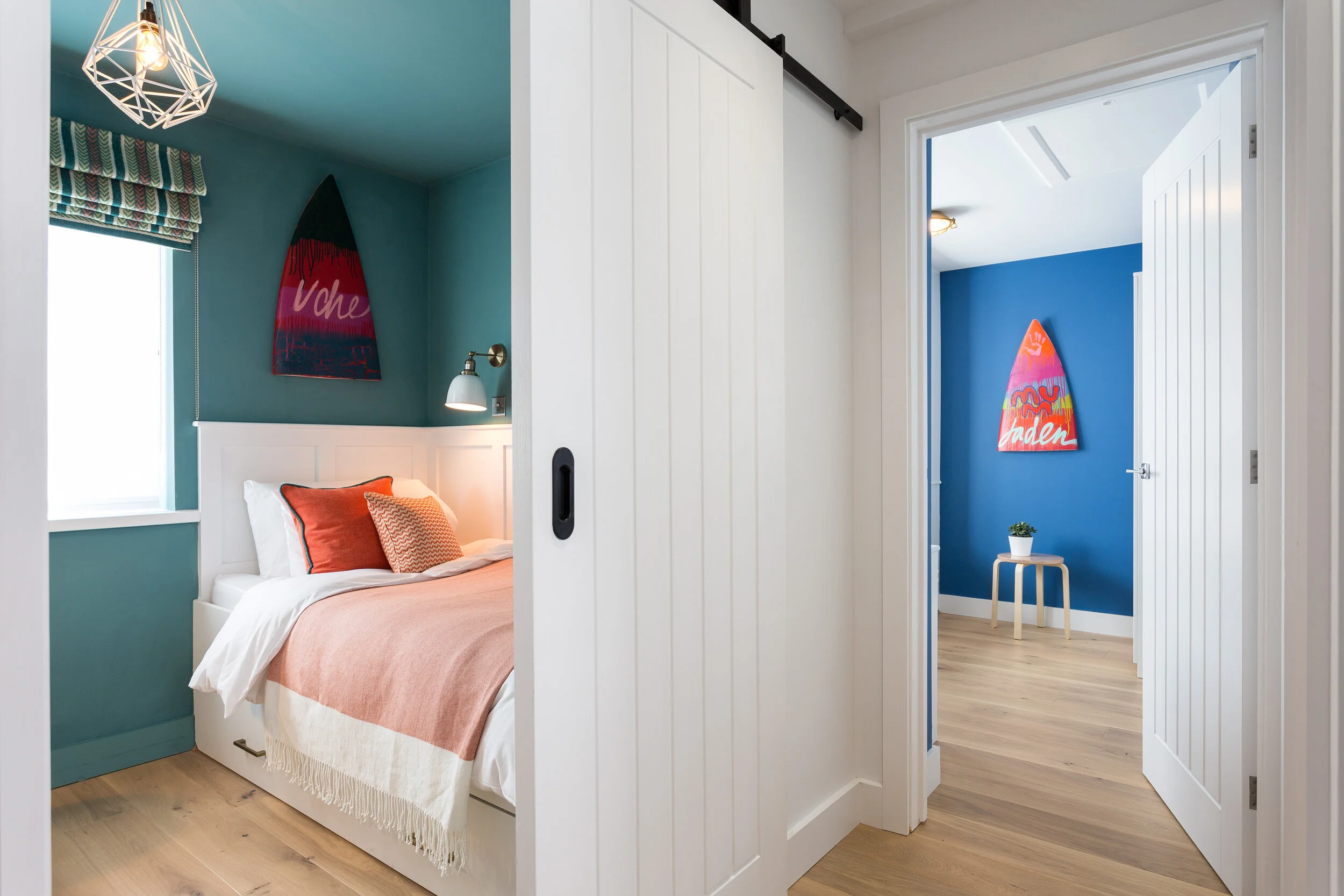
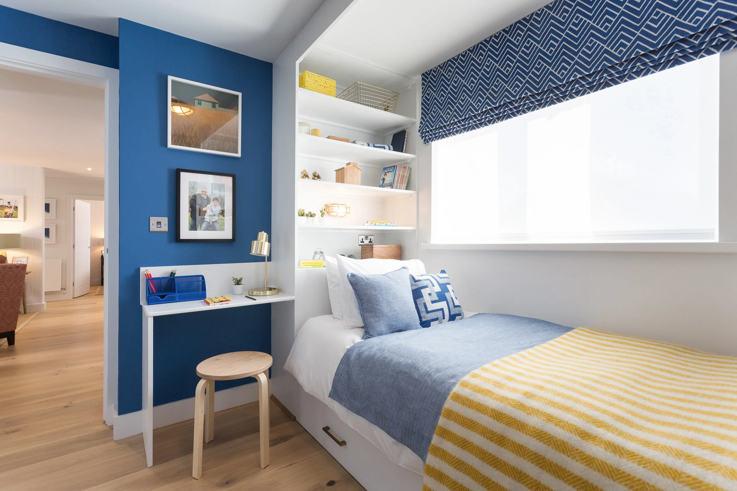
There was a lot of built-in furniture installed so that we could make the most of every nook and cranny that was available. The two younger boys also had built-in beds installed to maximise the floor space of their bedrooms. They were both also keen to be able to have their friends stay over so we designed their beds to have a pull-out bed under them too. Another design team tactic was to install sliding doors, creating more useable floor space.

 
Bedroom with a panelled door on a black sliding door mechanism
 
 
Blue bedroom with a white painted bespoke cabin bed containing shelving and a desk
 

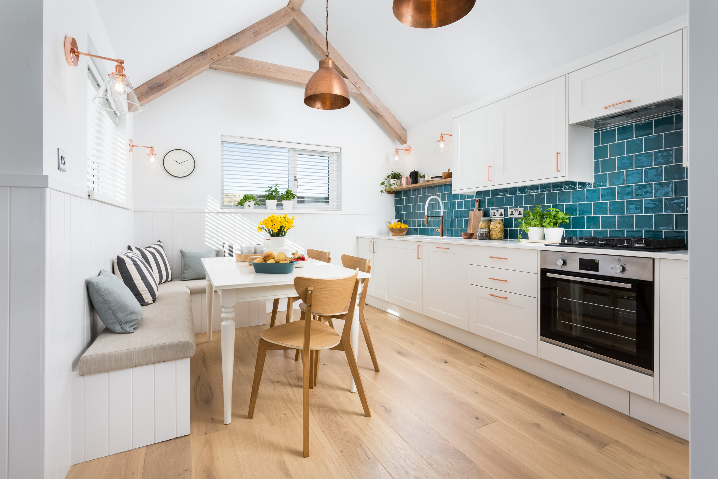
The kitchen diner was located in the new extension and was definitely my favourite room. As a design team we had begged the build team to allow us to do an internal pitched ceiling and we had finally been granted permission. It was worth the wait! Again, with our maximising of space at the forefront of the design, we incorporated a banquette to allow more people to sit around the table. Although the room was painted white, it still felt cosy because of the warm timber floor and the beautiful copper accents in the lighting and kitchen handles. 

 
White kitchen diner with square turquoise tiles an exposed oak beam ceiling
 

Working on DIY SOS is such a treat and this project was definitely one of my favourites. We had a wonderful, talented production team and amazing trades and suppliers working on the Smedley’s home. To catch up click here. For a list of the products used on DIY SOS: Carbis Bay click here

 
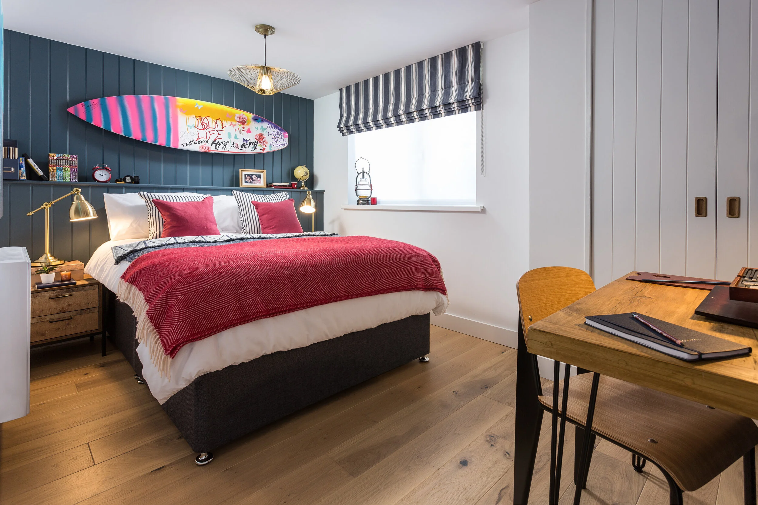
Double bedroom with a charcoal painted tongue and groove feature wall with a surfboard above the bed
 
 
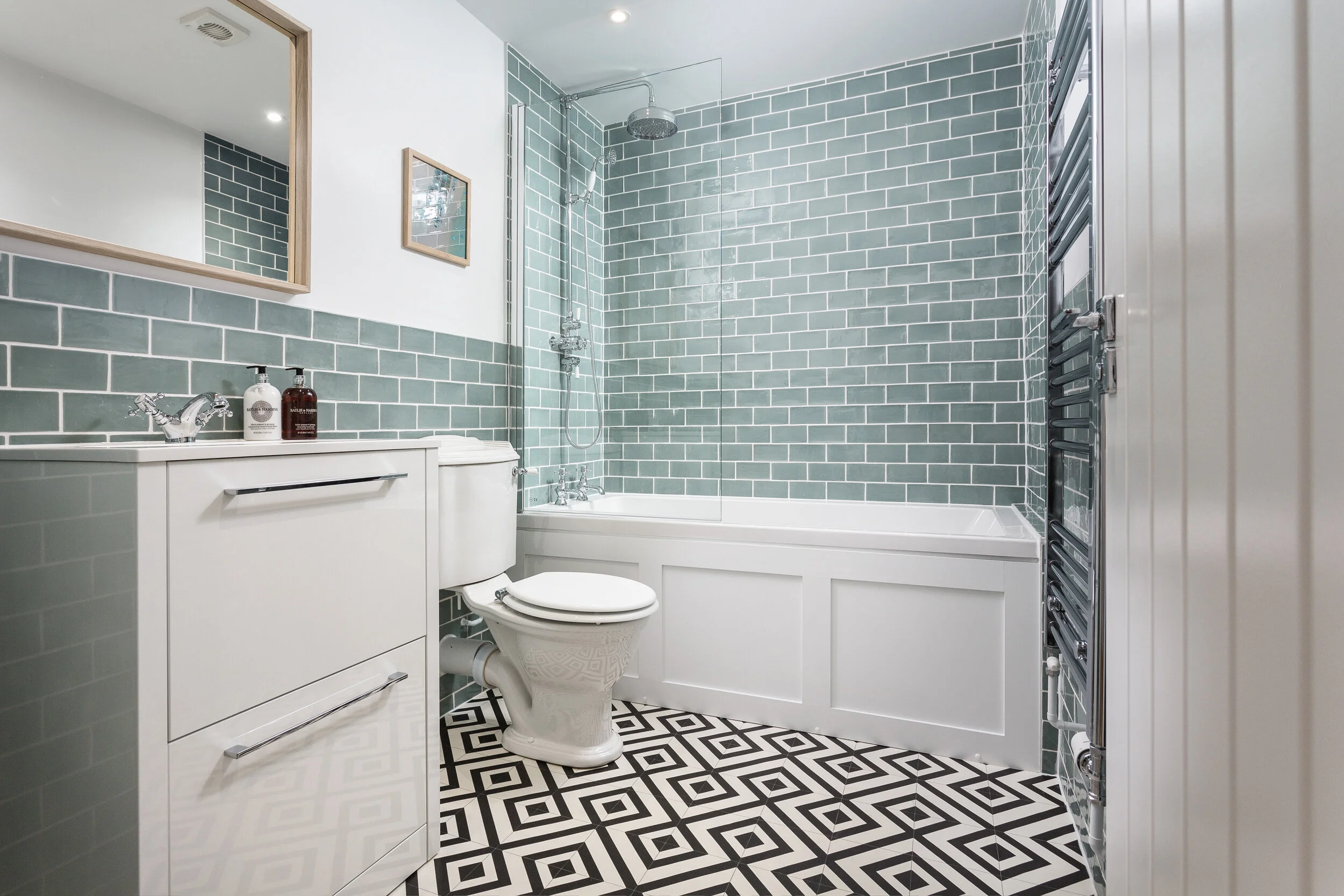
Green bathroom with a shaker style panel, metro tiles and a black and white geometric floor
 
 
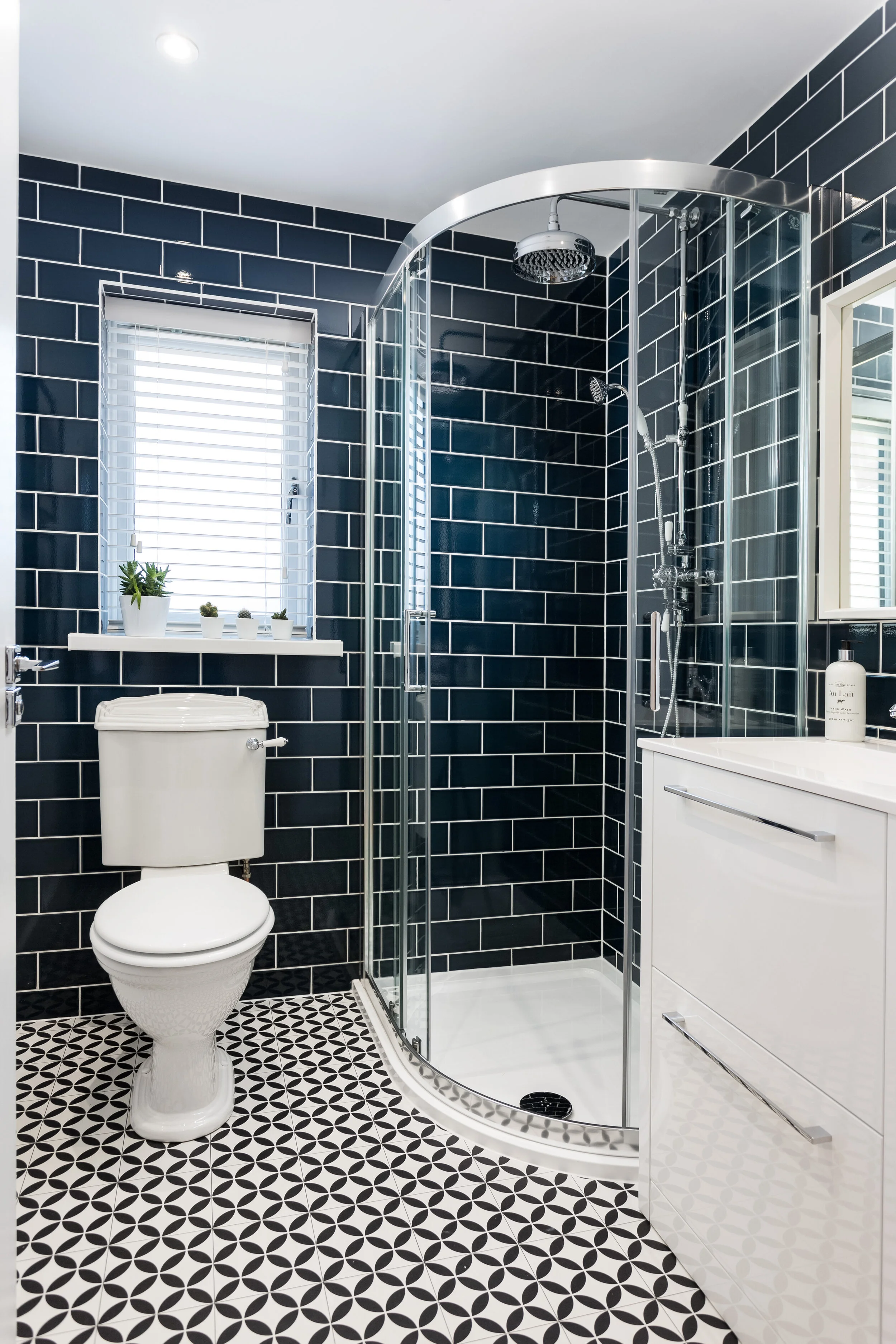
Shower room with dark navy metro tiles and black and white patterned floor
 

All photography by Elliott White Photography

Alternative Ideas for Your Baby’s Bedroom That Aren’t Blue or Pink

It is the dream of many people to be able to design and redecorate a room in their house from scratch, with new furniture, new colours on the wall and new soft furnishings - the whole lot. A great time to do this is just before you have your first baby. When I was expecting my baby, many midwives, parents, friends and even random people on the street asked me if I had been ‘nesting’. Initially, I thought this just sounded a bit strange and I didn’t really understand what they meant but I soon realised that it really is a mum’s opportunity to release her inner interior designer and create a beautiful bedroom for the new arrival.

 
Image From: Bre Purposed

Image From: Bre Purposed


At some point in the last century we have become less creative when it comes to the interior design of a baby’s bedroom and we have stuck to society’s norm: blue is for boys and pink is for girls. This, however, wasn’t always the case. Back in Victorian times, they would dress boys in a paler version of the colours men would wear, such as red, hence why boys often wore pink. During the 20th century, however, there was a turn and today pink is synonymous with girls.

So let’s be creative and break today’s stereotype! Let me give you a few ideas to make sure your baby’s bedroom isn’t a cliché and is, instead, unique, stylish and beautiful.

 
Image From: Project Nursery

Image From: Project Nursery


1. Alternative Colours

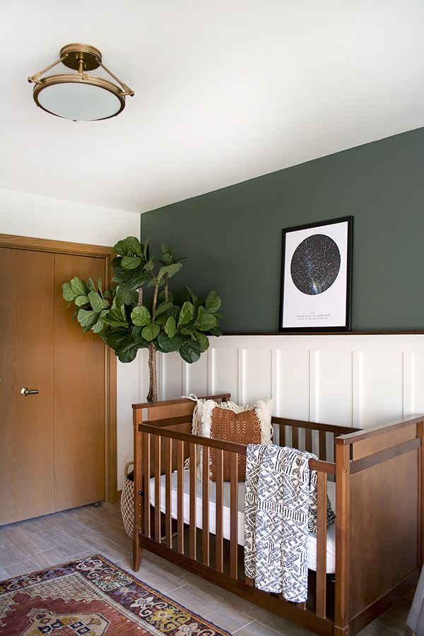
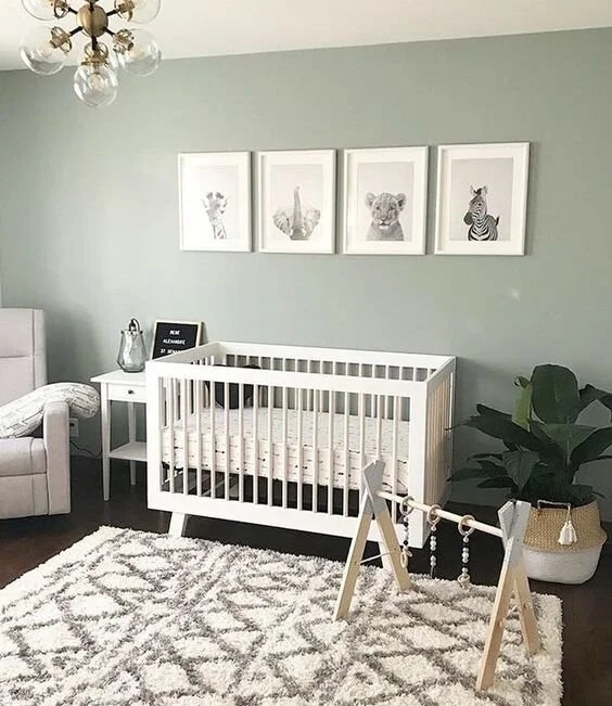
If you want to paint your baby’s bedroom in a brighter colour, green is a great gender-neutral colour to use. Its association with nature and the outdoors will make your baby’s room feel restful and calm. Other gender neutral colours you could use are red, orange or yellow, however, these colours are quite vibrant and not particularly relaxing, so would be better as an accent colour, in things like the curtains or blankets, but not to use to paint the walls.

 
Image From: Pinterest

Image From: Pinterest


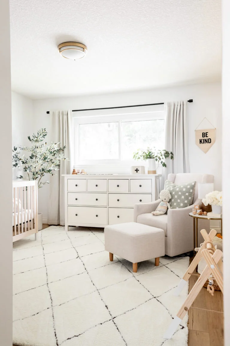
Neutral colours such as white, grey or a light shade of beige are great shades to use for a fresh bedroom feel. I would advise not to go for a ‘bright white’ colour as it will make the bedroom feel like it hasn’t been thoughtfully designed and it will make the room feel quite cold and bare. By choosing a shade of white, such as Farrow and Ball’s Strong White, the room will feel much cosier. For a shade of beige, Farrow and Ball’s Lime White is a really interesting light shade which makes a room feel much warmer and homely.

 
Image From: Halfway Wholeistic

Image From: Halfway Wholeistic


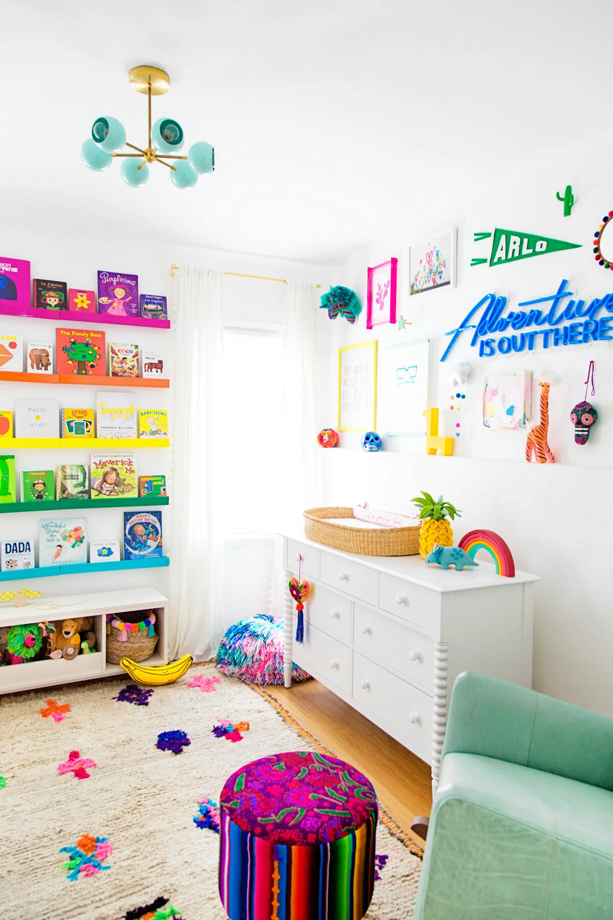
If you were to go for neutral coloured walls, but still wanted to add a bit of colour to your baby’s room you could do this through the furniture and accessories. You can paint your changing table or chest of drawers or use brightly coloured bedding in your cot. The nursery in the image below has a rainbow-coloured theme to it, meaning that anything bright and colourful fits into the colour scheme and looks great when displayed.

 
Image From: Studio DIY

Image From: Studio DIY


2. Wallpaper

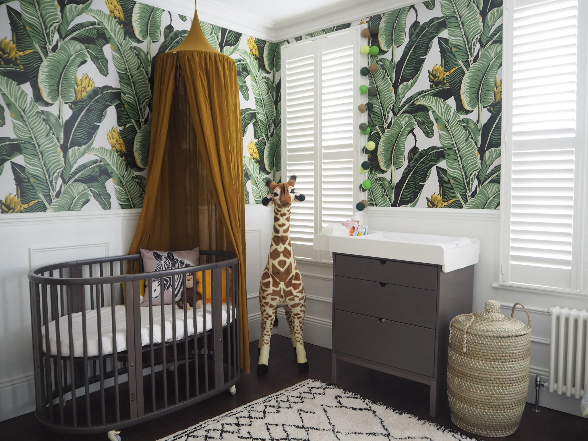
At around 3 months a baby can see patterns, so why not encourage this development with a bit of wallpaper in the room? Instead of choosing a colour as the main theme to a room you could have an amazing wallpaper instead. There are some incredible animal wallpapers or nature wallpapers or even geometric patterns. The wallpaper doesn’t just have to go onto the walls, babies spend a lot of time on their back looking at the ceiling so why not wallpaper the ceiling?

 
Image From: House Lust

Image From: House Lust


3. Decals

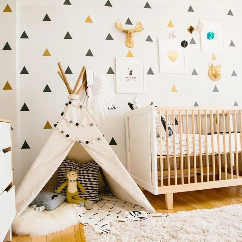
Another easy and cheaper way to make the walls of your nursery more interesting, instead of wallpapering them, is to use wall decals. Wall decals are stickers that you can stick to the wall, but they have been made so that they can be easily removed without damaging the paint (so great if you are renting your home). There is a massive variety of decals that are available designed with large groups of leaves and trees to individual stars and circles which you could arrange into patterns for your baby to enjoy.

 
Image From: Just Kidding Store

Image From: Just Kidding Store


I hope these ideas have provided you with some alternative ideas to think about when designing a nursery, if you decide not to decorate using blue or pink. Enjoy, as this is your opportunity to create a beautiful bedroom for your baby.